DISCOVERY
The problem
Self-reflection supports emotional well-being, but most journaling apps fail users in predictable ways.
They're either too clinical, too vague, or too productivity-focused.
People want to reflect, but existing tools create friction instead of removing it.
Research approach
I studied existing journaling apps, read behavioral psychology research on habit formation, and interviewed 8 young professionals about their relationship with reflection.
Common pain points:
Blank page paralysis:
"I never know what to write"Guilt around inconsistency:
"I feel bad when I miss days"Permormative pressure:
"It feels like I'm writing for someone else"
I learned that…
The barrier to journaling isn't motivation, it's friction.
Problem definition
How might we remove friction from daily reflection while building sustainable habits?
From research, three core needs emerged:
Structure without rigidity:
Users need guidance to start, but freedom to reflect authentically.Progress without pressure:
Visualization should motivate, not guilt-trip when someone misses a day.Emotional safety:
The app needs to feel like a private, judgment-free space.
Design principles
Based on these insights, I established three principles:
Gentle by design:
Soft language, warm colors, forgiving streaks.Start simple, go deep:
Low barrier to entry with optional depth for engaged users.Growth feels good:
Progress is visualized, not numerical.
Behavioral framework
I designed Echo around the Hook Model to build lasting habits:
Trigger: daily notifications at user-chosen times
Action: one-tap "Reflect Now" with guided prompts
Reward: zen garden grows, mood insights appear
Investment: personalized reflections accumulate, creating emotional attachment
This creates a feedback loop where reflection becomes intrinsically rewarding.
DESIGN
Core features
Echo is built around three interconnected experiences:
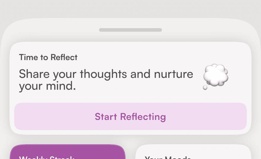
Guided Rituals
Structured journaling sessions that remove blank-page anxiety.
What it does:
Personalized prompts based on time of day and mood
Optional mood check-in before writing
Flexible depth—write one sentence or fill pages
Why it works:
Users know exactly where to start, but retain full control over what they share.

Mindful Milestones
Progress visualization that motivates without pressuring.
What it does:
Interactive calendar showing reflection history
Zen Garden that grows with each entry (not streaks)
Mood patterns visualized over time
Why it works:
Missing a day doesn't "break" anything, the garden simply pauses growing. This removes guilt while maintaining motivation.

Responsive Journaling
The app adapts to each user's emotional state and writing style.
What it does:
Prompt selection adjusts based on mood input
Reflection modes (quick check-in vs. deep dive)
Tone matches user's energy (calm vs. energetic)
Why it works:
On tough days, the app meets users where they are. On good days, it encourages deeper exploration.
Key design decisions
I studied existing journaling apps, read behavioral psychology research on habit formation, and interviewed 8 young professionals about their relationship with reflection.
1. Why a Zen Garden instead of streaks?
Traditional streak counters create anxiety and guilt when broken.
A zen garden …
Grows organically with use
Doesn't "die" if you miss days
Visualizes progress without numbers
Feels calming, not gamified
2. Why guided prompts?
Blank pages are intimidating.
Prompts provide:
Structure for beginners
Inspiration when stuck
Emotional scaffolding for difficult reflections
3. Why mood tracking?
Mood data:
Helps users spot patterns over time
Personalizes future prompts
Validates emotional experiences
Creates tangible value from reflection
Visual language
How Echo's interface reinforces its emotional purpose:
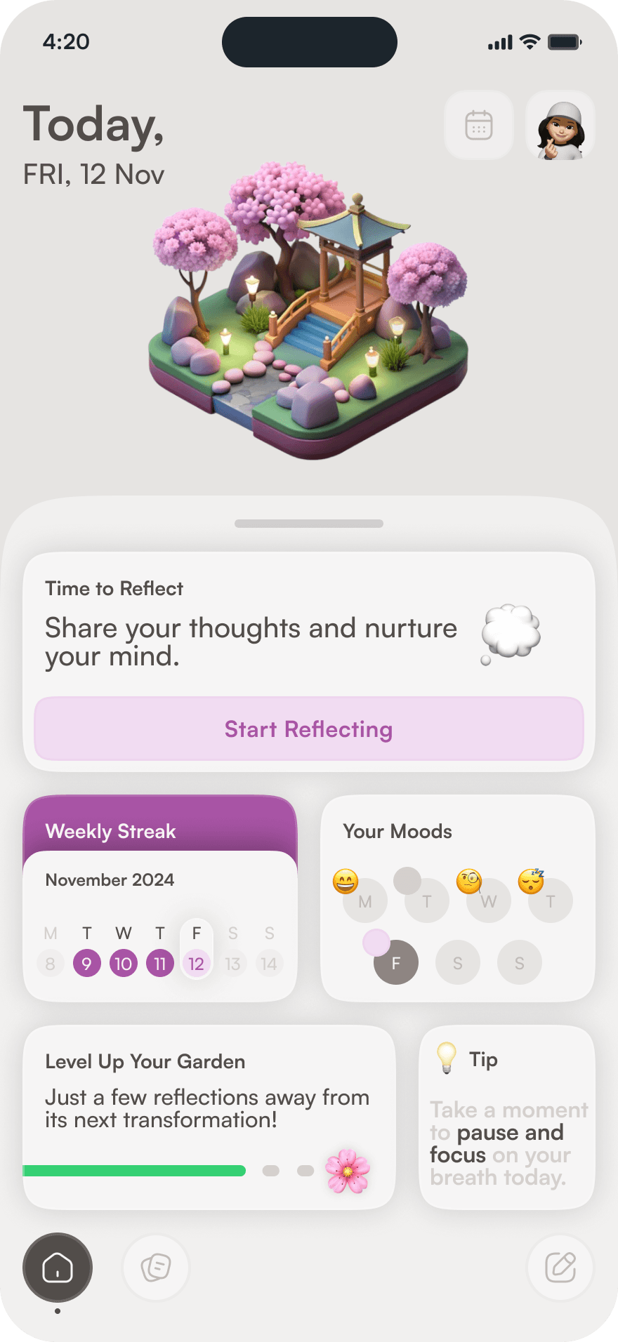


Key screens
Behavioral framework
I designed Echo around the Hook Model to build lasting habits:
Trigger:
Daily notification at user-chosen timesAction:
One-tap "Reflect Now" with guided promptsReward:
'Zen Garden' grows, mood insights appearInvestment:
Personalized reflections accumulate, creating emotional attachment
This creates a feedback loop where reflection becomes intrinsically rewarding.
IMPACT
What I learned
Designing Echo taught me how UX can support emotional sustainability:
Less pressure = more consistency
When I removed streak counters and replaced them with the Zen Garden, the app felt less like a chore and more like a choice. Pressure kills habits; permission sustains them.Small rituals build momentum
Users don't need big goals, they need tiny, repeatable actions. A single prompt each day is more powerful than a weekly goal of "journal more."Tone matters as much as usability
The app's voice ("How are you feeling?" vs "Log your mood") dramatically changes how it feels to use. Warmth and empathy are design decisions.
Validation
While this was a solo project without formal user testing, I validated core concepts through:
Behavioral research
Competitve analysis
Informal feedback
Key feedback:
"The 'Zen Garden' feels way less stressful than streaks"
"I love that I can just tap and write instead of having to setup"
"This actually makes me want to reflect"
If I continued this project...
1. Near-term improvements:
AI-generated weekly summaries (showing themes and growth
Seasonal Zen Garden themes (spring blooms, autumn leaves)
Voice journaling option (for times when typing feels hard)
2. Long-term vision:
Optional anonymous community sharing (connecting users going through similar experiences)
Integration with therapy apps (with user permission)
Export journal entries as beautifully formatted PDFs
3. What I'd do differently:
Conduct more formal user testing with target demographic
Validate retention mechanics (e.g. what keeps users coming back after Week 2?)
Explore revenue model early (freemium? subscription? one-time purchase?)
Reflection
Echo was my first deep dive into designing for emotional sustainability.
The biggest challenge? Balancing structure with freedom. Too much guidance feels restrictive; too little feels overwhelming. Finding that middle ground, where users feel supported but not controlled, required constant iteration on tone, prompts, and visual feedback.
The most rewarding part? Realizing that good UX isn't just about efficiency, it's about making people feel seen, supported, and capable of growth.